The patched-together May Day holiday is coming to an end, and the annual social media photo-sharing competition is about to kick off. Although smartphones’ built-in auto-enhancement features are getting increasingly powerful, they can’t satisfy us programmers’ desire for fine-grained control over everything. Below, I’ll share some of my humble color-grading experience, using a photo I took at Tianxin Pavilion in Changsha as an example, to teach you a dragon-slaying technique for landscape color grading that turns a fake into the real deal. Finally, I’ll give a brief summary of photo editing principles to explore the essence behind image color grading.
Before & After
To show that photo color grading really works wonders, here’s a side-by-side comparison for an intuitive feel:
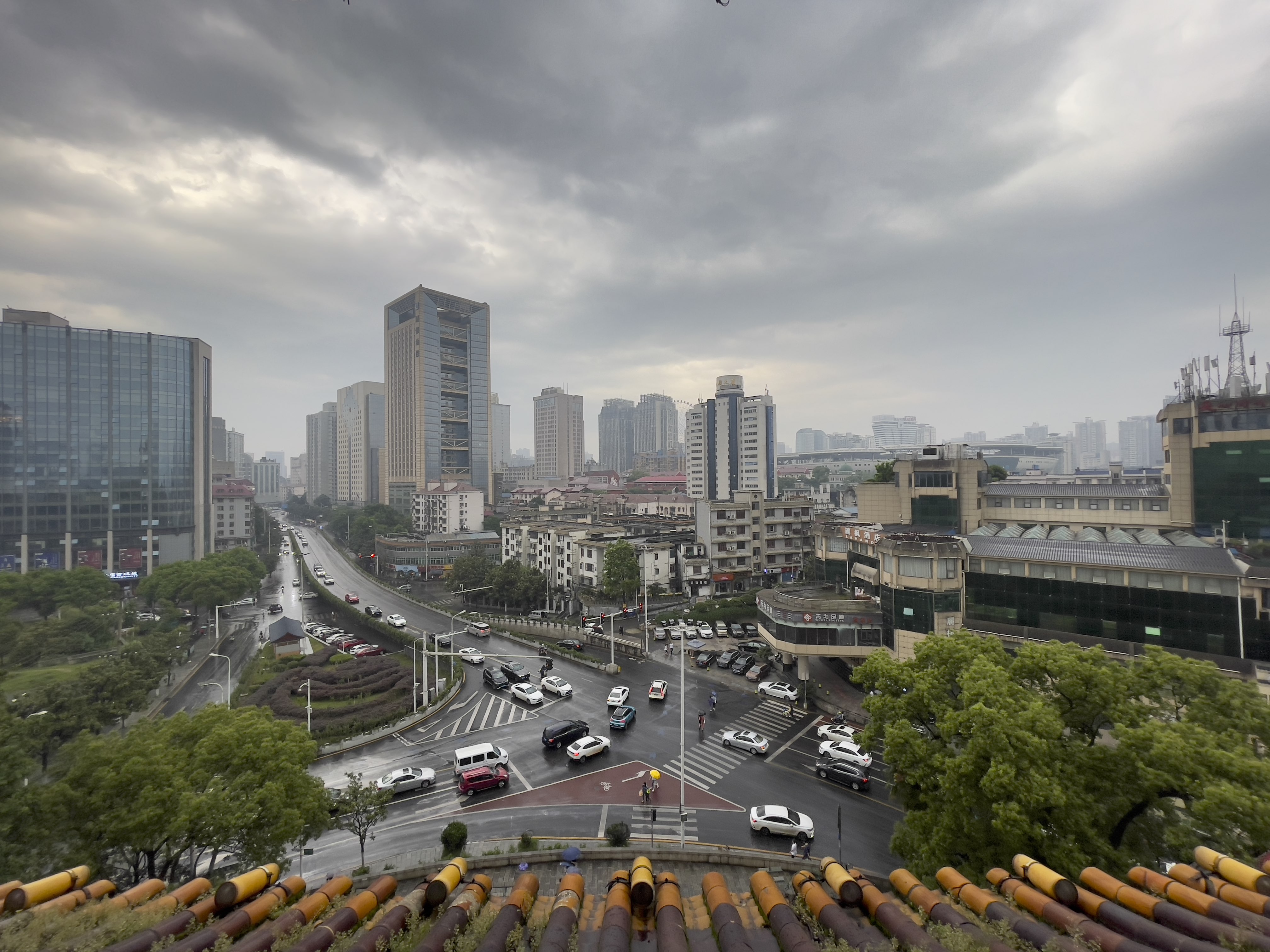 对比图-调色前.jpg
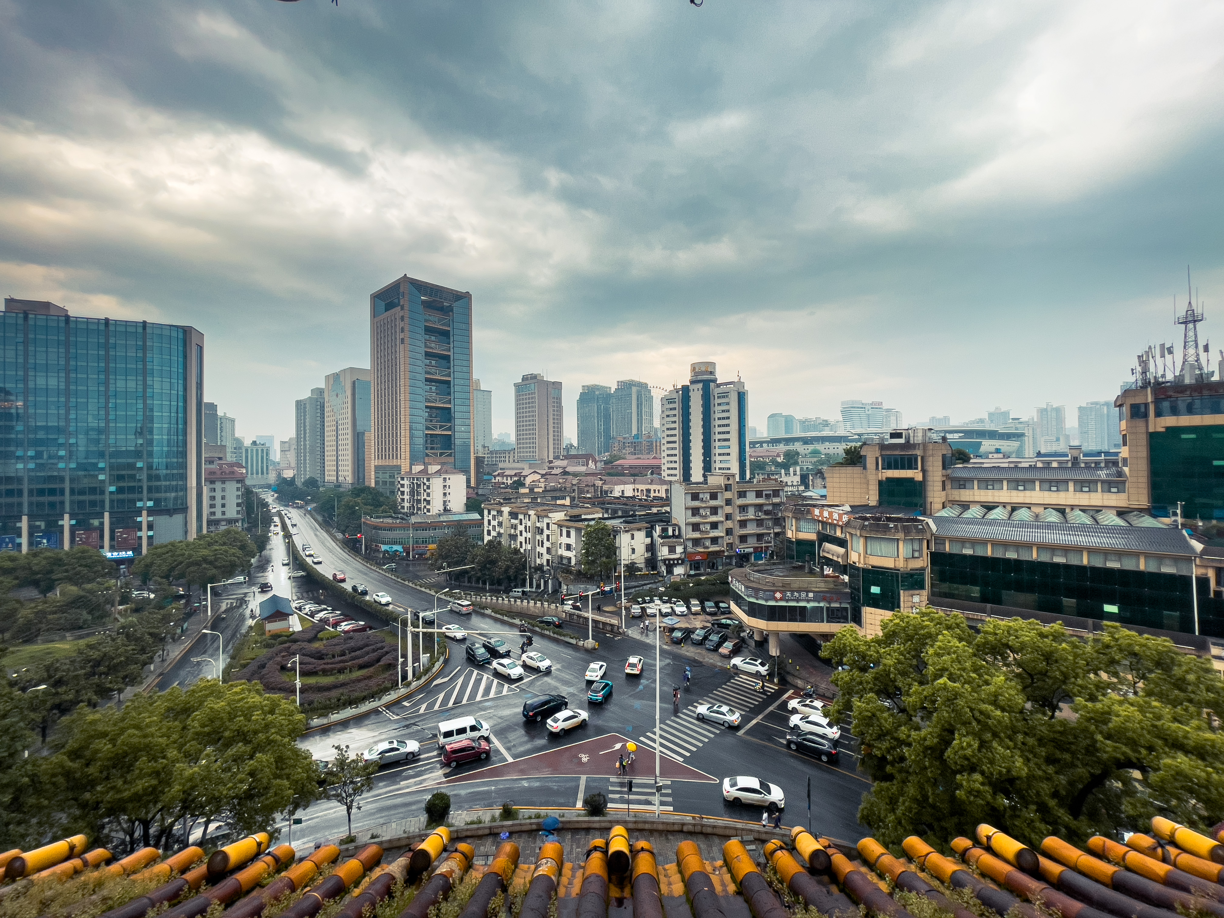 对比图-调色后.jpg
This photo was taken at Tianxin Pavilion, the commanding height of old Changsha. That day, dark clouds gathered and a storm was approaching. Looking into the distance from the second floor of Tianxin Pavilion, yellow tiles and blue sky, bustling traffic — motion and stillness intertwined, as if with the momentum of thunder.
Below I’ll explain the color grading process and principles step by step, keeping it as concise as possible, with reference materials for those interested in digging deeper.
Author: Woodbird Miscellany https://www.qtmuniao.com/2021/05/08/adjust-scene-photo/, please indicate the source when reposting
Photography
Gear: Taking iPhone as an example, if you have an iPhone 12 Pro, be sure to use RAW format when encountering spectacular scenery. You can find the relevant settings in Apple’s official documentation. Those with experience using digital cameras are certainly no strangers to RAW format — it allows you to retain more detail when shooting, giving you more room to work with in post-processing. It’s fair to say that RAW support was one of my main motivations for buying the iPhone 12 Pro.
Composition is very important, but it’s not the topic of this article, so I won’t go into detail here. Just one tip: be sure to turn on the rule-of-thirds grid lines — they let you see the relative position of your subject in the frame. If you’re interested in composition techniques, check out this tutorial by Thomas. By the way, his introductory photography articles are all quite good, and coincidentally, he used to be a programmer too.
Photo Editing Software
There are many photo color grading apps on the iOS platform, but I only recommend the undisputed #1: Adobe Lightroom. The basic features of this app are all free; only some advanced features require payment, but we generally don’t need those.
 lr图标.png
I believe there’s also a version for Android.
Color Grading Steps
Below, I’ll use the “View from Tianxin Pavilion” photo mentioned at the beginning as an example to walk through my thought process and workflow when editing a photo.
Step 1: Import & Correction
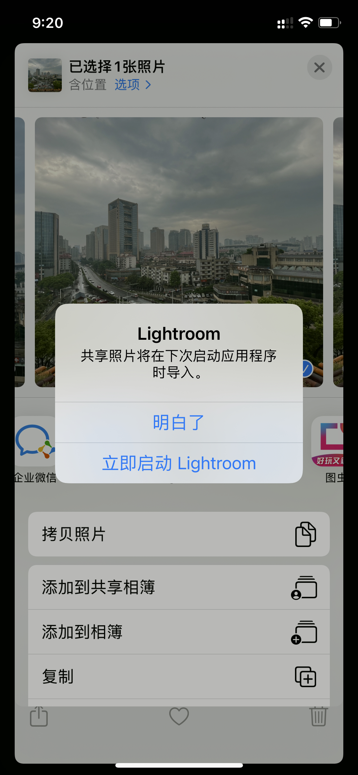
Open the original photo to be edited in the iOS Photos app, tap the share icon in the bottom-left corner, find Lightroom (if you don’t see it, try looking under More), import it, and select Launch Lightroom Now:
 导入.jpeg
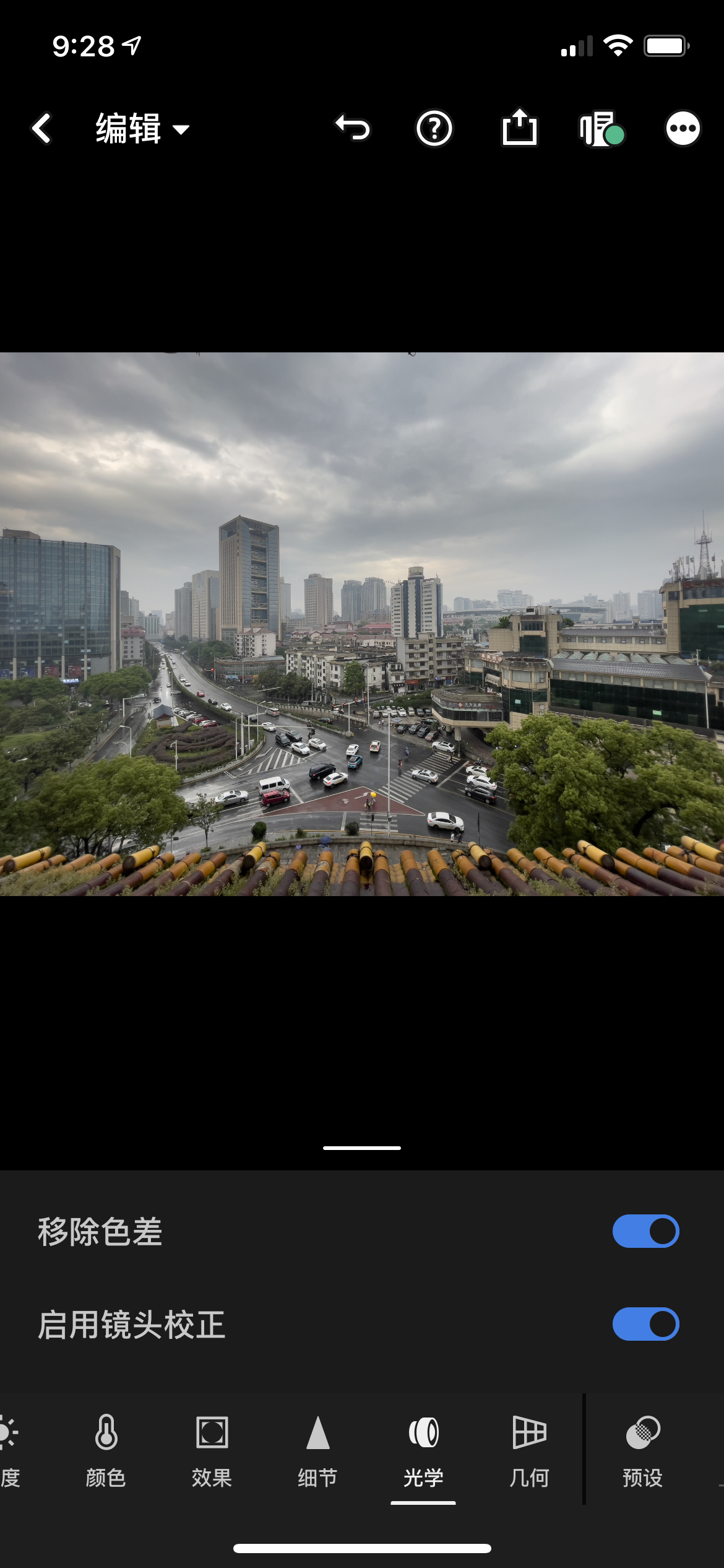
After opening Lightroom, select the photo you just imported, find the Optics section in the bottom navigation bar, and check Remove Chromatic Aberration and Enable Lens Corrections. For any photo, you can safely check both of these options, as they basically only have positive effects: for example, removing purple fringing and correcting lens distortion.
 移除色差-镜头校正.jpeg
Step 2: Image Tone
Just like writing an essay, you need to establish the tone of the image from the start.
I usually achieve this by adjusting the White Balance in the Color panel. To convey a cool, crisp atmosphere, move the Temperature slider to the left to make the image bluer overall; to express a warm, nostalgic atmosphere, move the Temperature slider to the right to make the image yellower overall.
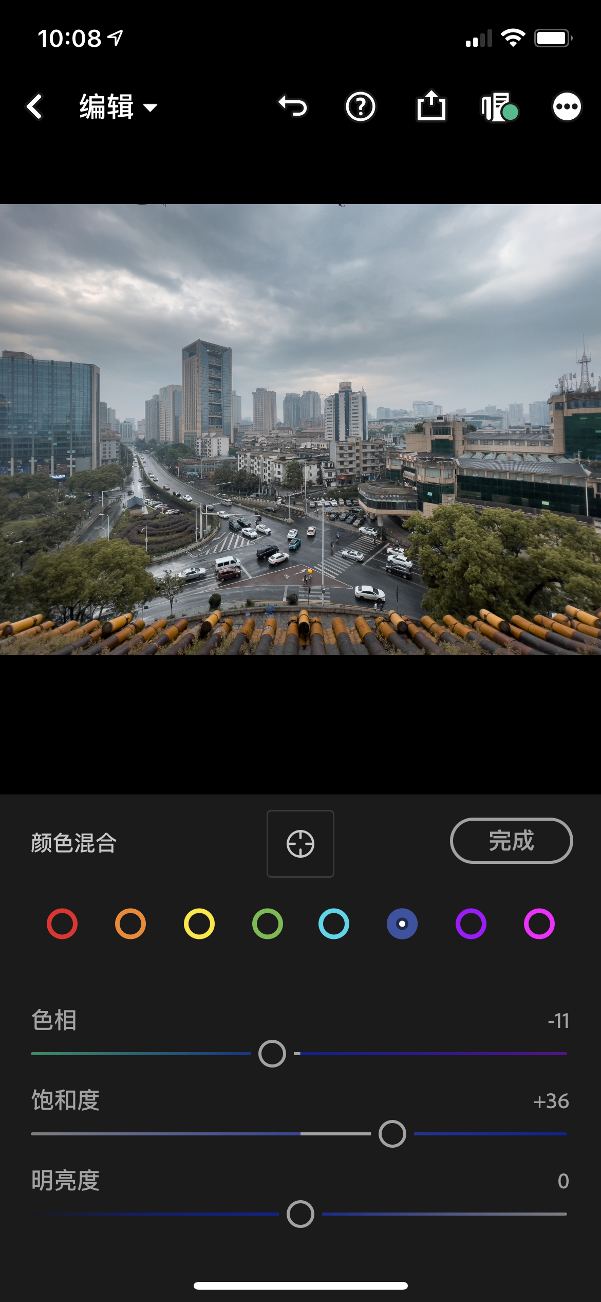
Looking at this photo, I noticed yellow tiles, blue glass, and blue sky. So I decided to go for the currently popular teal and orange look. Since these two tones pull in opposite directions, you can’t simply adjust the overall white balance of the image. Here I made several combined adjustments; the basic idea is to strengthen (increase saturation) the teal and orange tones while weakening (decrease saturation) other tones:
- Shift blue toward teal and increase the saturation of both. In
Color→Mix, shift blue toward teal/cyan, then adjust both saturation sliders slightly to the right. - Shift yellow toward orange and increase the saturation of both. In
Color→Mix, shift yellow toward orange, then adjust both saturation sliders slightly to the right. - Reduce the saturation of remaining colors.
 青橙色调.jpeg
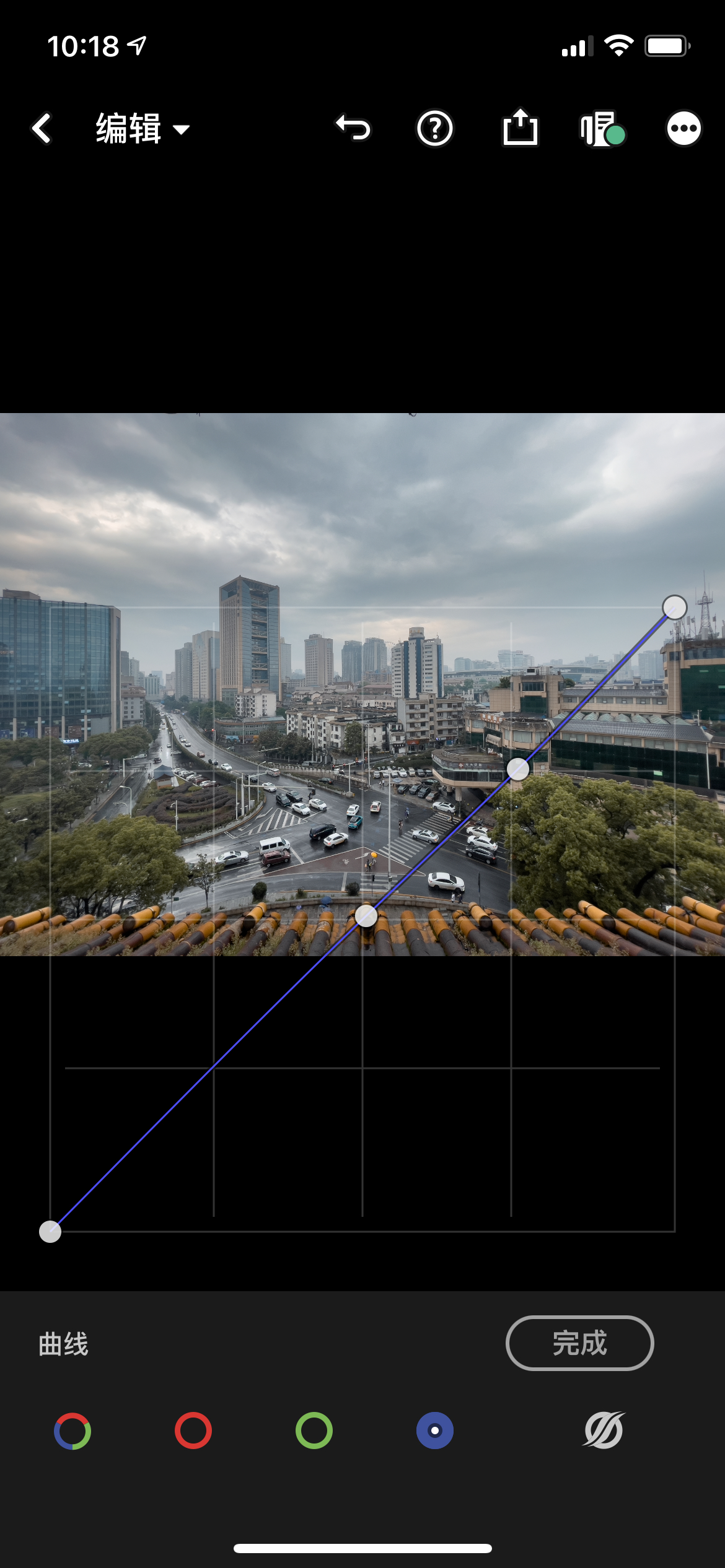
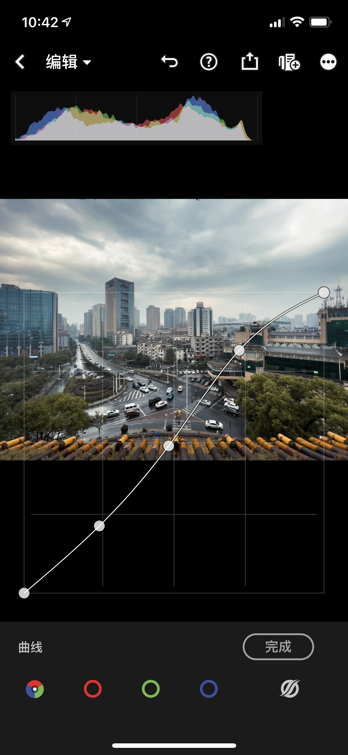
To add depth and dimension to the clouds, you can adjust the Blue Channel in Light → Curves. The Curves tool is quite interesting — essentially, it’s a visual representation of a brightness adjustment function, where input x represents the brightness values of all corresponding pixels, and output y represents what you want those brightness values to become. The way to use it is to add anchor points anywhere on the curve, then drag them to change the curve’s shape, i.e., change the mapping function. For more on curves, check out this article.
My general approach is:
- Add an anchor point in the middle of the diagonal line to lock in the mid-tone mapping.
- Add additional anchor points to adjust highlights or shadows.
Since the sky is the highlight area, add another anchor point in the upper-right portion of the diagonal and pull it down slightly — this adds some yellow to the white parts of the clouds (the complementary color of blue is yellow).
 蓝色曲线.jpeg
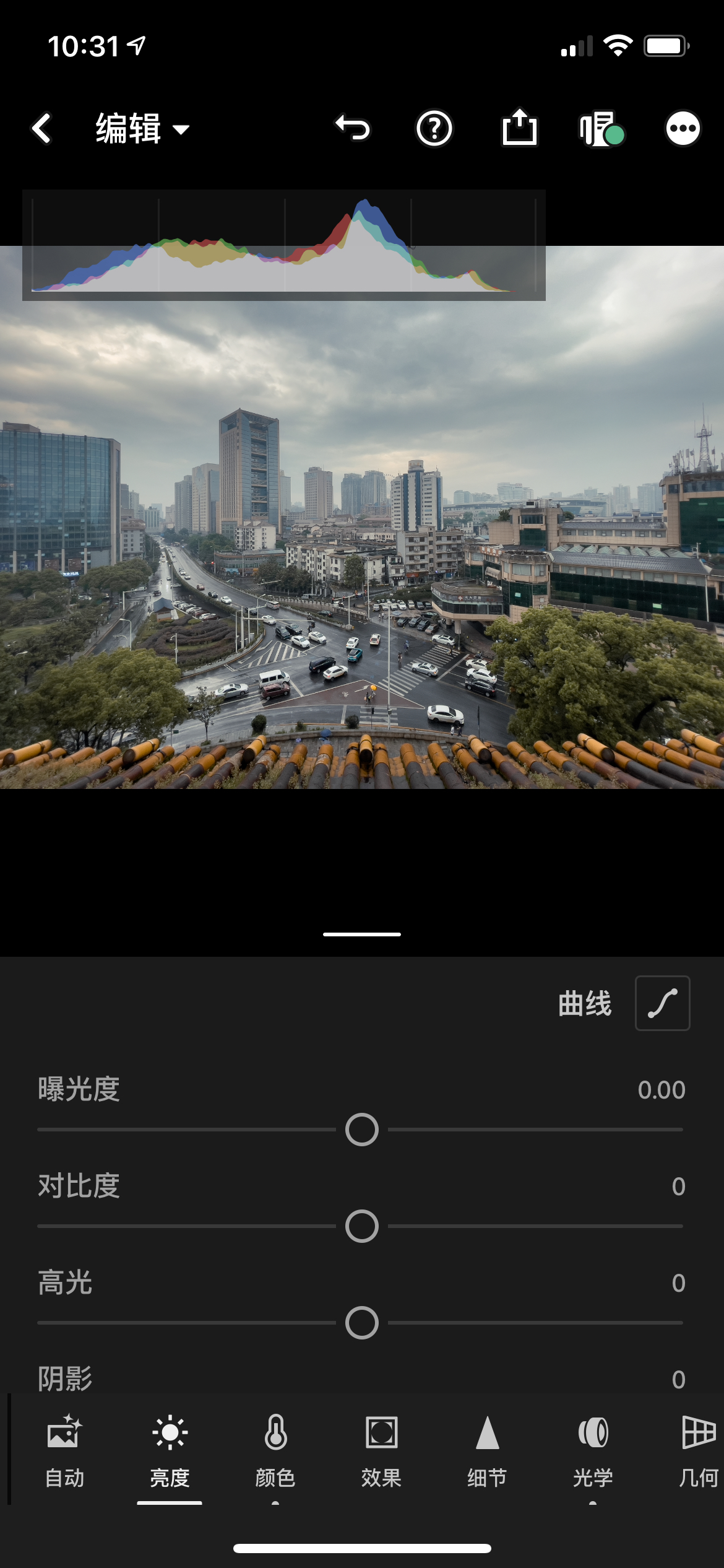
Step 3: Contrast
If you get a photo that looks hazy or washed out, it means most of its pixels are concentrated in the mid-tones (neither too dark nor too bright). Our photo has this tendency, so let’s bring up the histogram via Three Dots in the Top Right → View Options → Show/Hide Histogram:
 直方图.jpeg
We can see the “mountain peak” is concentrated in the middle, confirming our hypothesis. For more on histograms, check out this article — it essentially describes the distribution of pixel brightness counts across the image plane.
There are several ways to increase contrast:
- The simplest is
Light→Contrastand drag the slider to the right. But this method isn’t very refined; I generally useCurves. - Select
Light→Curves, and you’ll see four curves:Overall,Red,Green, andBlue. Here we just need to adjust the overall curve. The classic curve shape for increasing contrast is an S-curve — making highlights brighter and shadows darker, which instantly brings out the contrast.
 曲线-全局.jpeg
Step 4: Adding Clarity
By adjusting the contours of objects in the image to make them sharper, you can make the photo look more transparent and clear. Adjusting contrast also has this effect. In the Effects panel, you can adjust the Texture, Clarity, and Dehaze sliders. These three sliders affect increasingly larger edges: Texture targets fine details, Clarity targets larger object outlines, and Dehaze is somewhat similar to changing contrast. So generally, I adjust Texture the most, Clarity second, and Dehaze least:
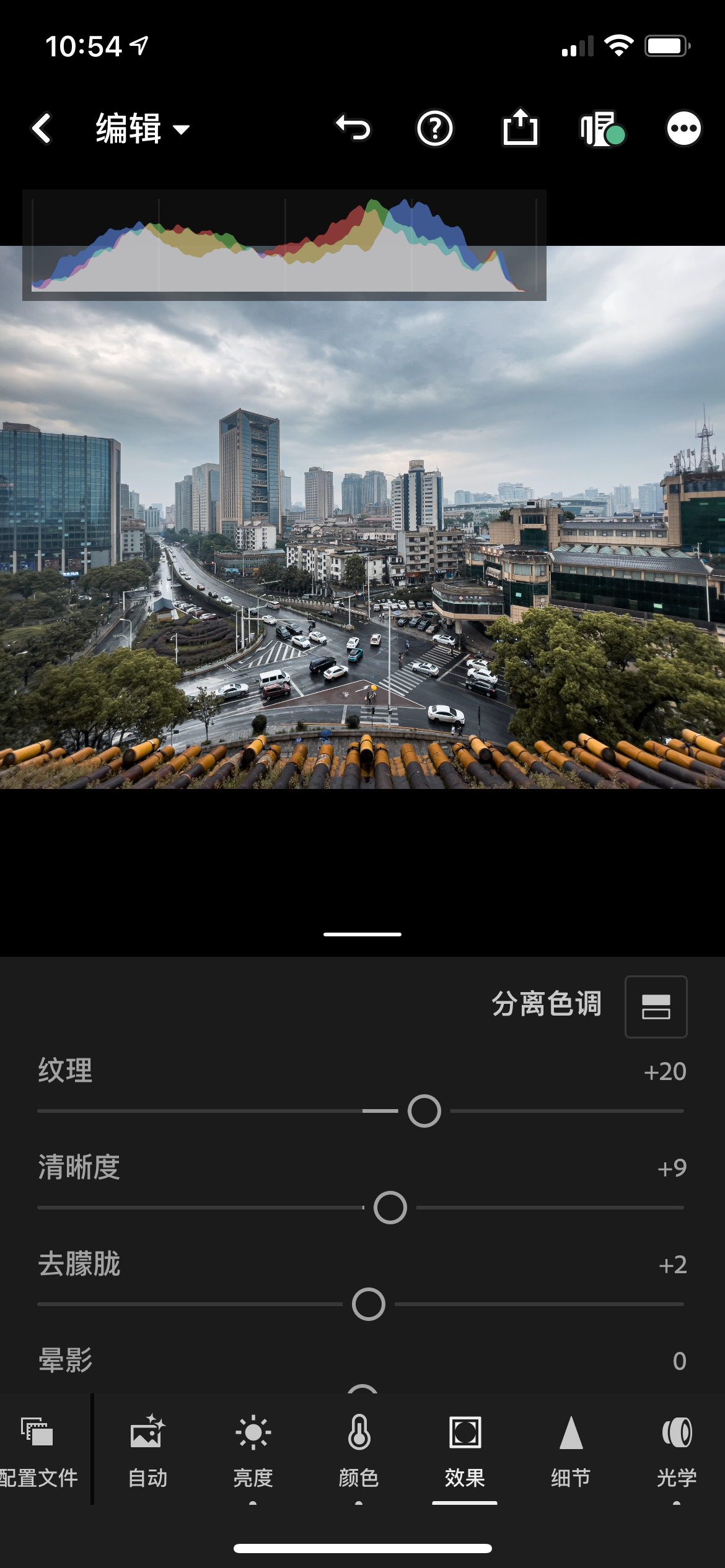 效果-通透.jpeg
You can see the edges of objects become sharper, further emphasizing texture.
Additionally, appropriately increasing local contrast in highlights and shadows can also make the photo more transparent. The specific method is to adjust in the Light panel:
- Move
Whitesto the right andHighlightsto the left, making the brightest parts brighter while darkening the next-brightest parts, increasing highlight contrast. - Move
Blacksto the left andShadowsto the right, making the darkest parts darker while brightening the next-darkest parts, increasing shadow contrast.
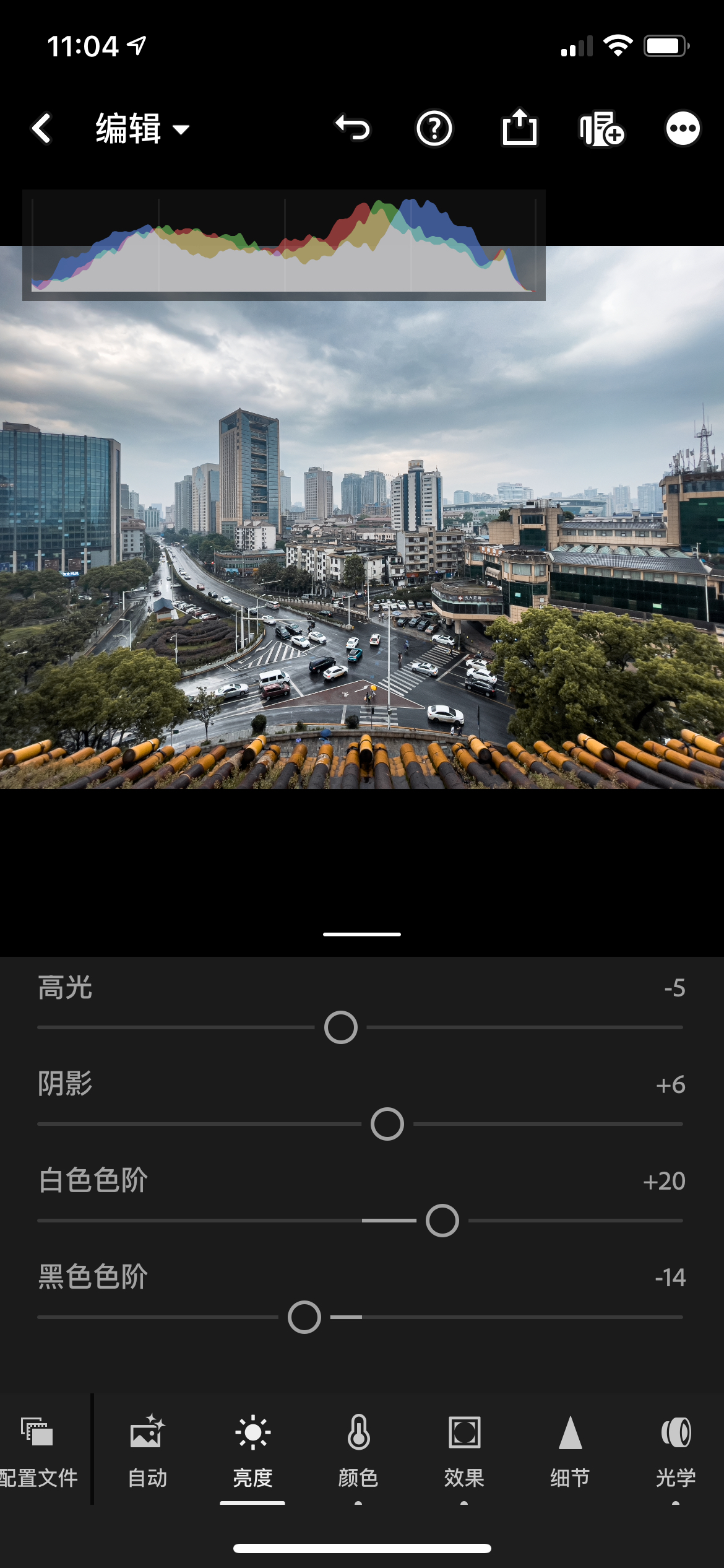 高光阴影-局部对比.jpeg
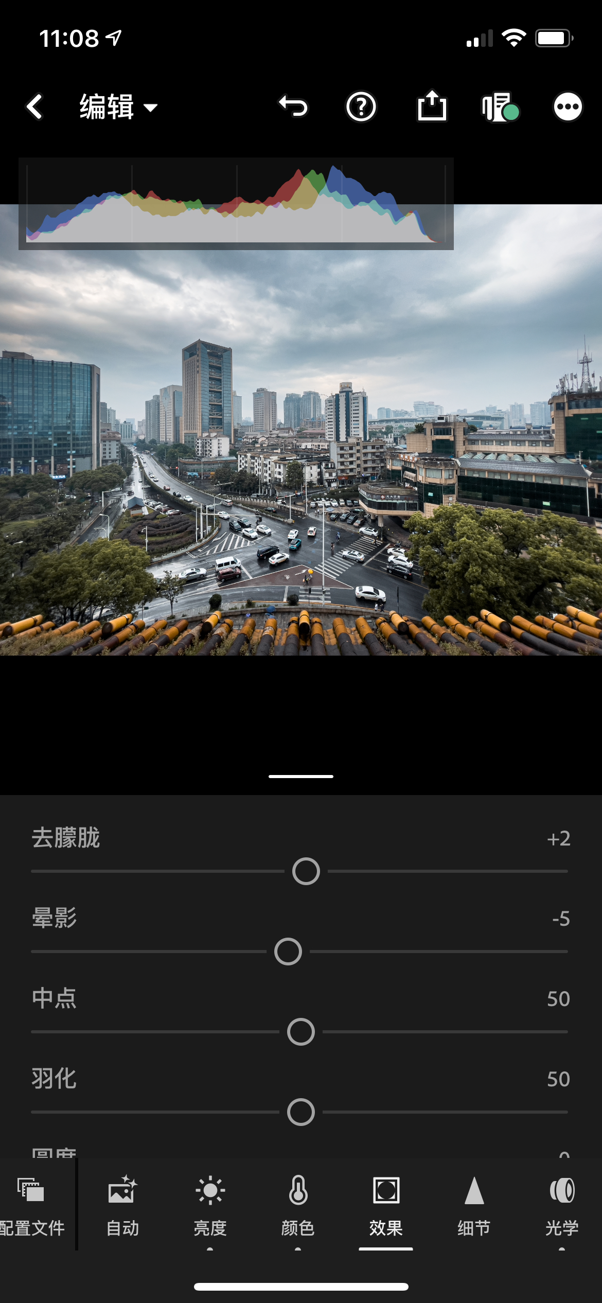
Step 5: Finishing Touches
This step depends on personal preference — you can add some Effects, such as Vignette (can make the subject stand out more), or Grain (creates a film-like texture, giving a nostalgic feel), etc. For landscape photos, I usually add some vignette:
 效果-晕影.jpeg
Step 6: Export
At this point, the photo is basically done. Finally, tap the share icon in the top-right corner → Export As, and choose the image quality according to your preference.
Principles Analysis
Below is the “knowing why” phase; those not interested in theory can skip ahead.
The essence of image color grading is: “Selection — Adjustment”. Selection means choosing the set of pixels you want to affect; adjustment means changing some attribute value of that set. There are many means and angles of selection, depending on how you view the pixel set of the image:
- View it as sets of points with different brightness levels. Under the
Lightpanel,Blacks - Shadows - Highlights - Whitescan respectively select pixel sets of different brightness levels from dark to bright, and then make these sets brighter or darker. Additionally, the image histogram is a more fine-grained representation of the brightness distribution across the entire image, so when editing, always pay attention to the histogram in the top-right corner of Lightroom — the histogram is also known as the image’s X-ray. - View it as sets of points with different colors. Any pixel’s color value vector can be decomposed along the RGB (Red, Green, Blue) three-dimensional space, with each channel generally having integer values in the range of 0~255. It can also be decomposed along CMYK (the four printing primaries: Cyan, Magenta, Yellow, Black). In
Color→Mix, you can select these point sets to adjust theirHue,Saturation, andLuminance. - View it as sets of points in different physical regions. That is, group physically adjacent points together, such as adjusting the outline of a specific object — a tree, a person, etc. However, on a phone, you generally won’t do such fine adjustments because fingers can’t perform such delicate operations. But on a computer, this selection method is used quite a lot, such as in masking.
- View it as sets of points with different characteristics. Group together pixels that share some common characteristic, such as selecting all object edges in an image and sharpening them, which can make the entire image clearer.
Finally, I’d like to mention that tools are just tools after all — what matters most is the intention to express a certain mood or emotion. But that’s an advanced artistic topic for those with leisure and refined taste; we overworked programmers wouldn’t understand.
References
- Apple official documentation on Apple ProRAW: https://support.apple.com/zh-cn/HT211965
- Thomas’ introductory photography articles, which include detailed explanations of the curves and histogram knowledge mentioned in this article: https://mp.weixin.qq.com/s/AJZYNIt7H3AC6aKLIDG_vg